A Guide to the Colour Wheel
Did you know that colour plays a huge role in how we perceive the world? A great way to understand this is through the colour wheel. The colour wheel was originally discovered by Isaac Newton in 1665, and is a tool used to help us understand the relationships between different colours, including primary, secondary, and tertiary colours. In this blog post, we will discuss the basics of the colour wheel and how you can use it to create beautiful and harmonious designs. So grab your coloured pencils and let's go!
Primary, Secondary & Tertiary Colours
The RYB colour wheel is the most common model used by artists around the world. The acronym RYB stands for red, yellow, blue, depicting the primary colours. We explain the relationship between primary, secondary and tertiary colours below:
- Primary Colours: these include red, blue, and yellow and provide the foundation for every other colour. These colours cannot be mixed from other colours.
- Secondary Colours: these include orange, green, and purple and are colours that result from the combination of two primary colours.
- Tertiary Colours: these colours are made by combining a secondary colour with a primary colour.

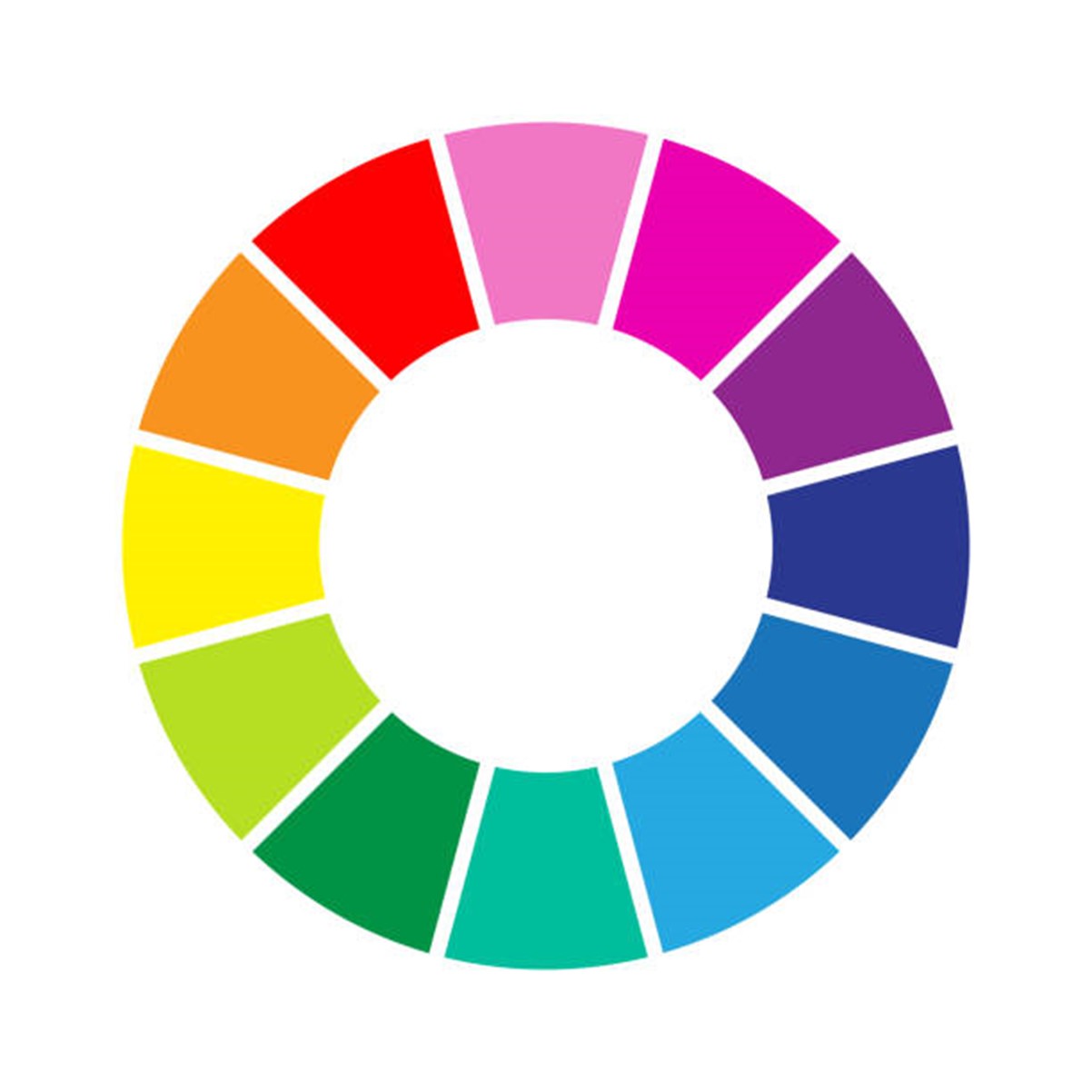
The Colour Wheel
The colour wheel is an illustrative organisation of colours featured in a circle, displaying the relationships between primary, secondary and tertiary colours. As mentioned above, artists (unlike graphic designers or other professions) use the RYB model. Using the RYB model, the primary colours, red, yellow and blue are positioned in three equally spaced points around the colour wheel.
Be sure to check out our Color Wheel Company Guides. They assist designers, crafters and painters to help create colour combinations and to understand colour relationships.
Warm & Cool Colours
The colour wheel may also be divided into warm and cool colours. This can be done (or visualised) by drawing a line down the middle of the colour wheel to separate the cool and warm. Colour temperature is the measure of a colour's warmth or coolness. Warm and cold hues are frequently combined in colour combinations on a colour wheel. According to colour theory, various colour temperatures evoke distinct emotions. For instance, warm colours are said to imply warmth and energy, while cool hues are linked to calmness and sadness. Examples of warm colours include red, orange and yellow, while, cool colours, include blue, purple and green.
Colour Combinations and Schemes
By mastering the basics of colours and how the colour wheel is constructed, it's time to investigate how colour theory may help you. Colour theorists, often have an easier time picking colours for their projects and obtaining the results they want as a result of this knowledge. Whether you're picking out art for your house, painting walls, or creating a masterpiece, knowing how to develop a successful colour scheme is essential. Let’s take a look at some colour schemes below.

Complimentary: Complementary hues are two colours that are directly across from one another on the colour wheel. Orange and blue, for example, are complementary colours. A colour scheme based on complementary hues will be quite vibrant since the two colours clash against one other. On a large scale, the stark contrast may make it difficult to deal with; but, used in small doses, it’s a great way to draw attention to a particular area.
Split Complementary: Instead of drawing a straight line across the wheel, as in the previous example, a split-complementary colour scheme uses one base colour and two adjacent colours that complement the base colour. So, if red-orange (vermillion) is the base colour, blue and green would be the other two colours in the scheme. The results are still vibrant, but as the contrast isn’t so strong it’s easier for beginners to work with.
Analogous: In a colour wheel, analogous colours sit next to each other and can create a sense of calm and serenity. Analogous colour schemes are frequently found in nature, and one hue generally dominates. The secondary colour helps the dominant hue by providing contrast, while the third is used more for emphasis. Because the colours are already harmonious, you want to be sure there is enough contrast to make your design pop.
Triadic: While not the most intuitive colour scheme, if done correctly, it may provide excellent results. Make a triangle on the wheel and you'll be struck by three equally separated hues. Purple, orange, and green (the secondary colours) are an example of triadic colours. Triadic hues are extremely vibrant and full; as such, use one dominant colour and use the other two as accents.
Tetradic: This colour scheme is made up of four hues, each divided into two complementary pairs. This vibrant palette may be difficult to work with at first, but it offers a lot of versatility. If one hue is dominant, it will look better. The use of equal amounts of colours may cause the overall design to appear unbalanced. Another factor to consider is the colour balance between warm and cool colours.
Square: There are four colours in the tetradic colour scheme, but they're evenly spaced around the wheel rather than being surrounded by a single hue. This palette is similar to tetradic hues in that one colour predominates and the others serve as accents. Otherwise, it might appear chaotic. Warm and cool hues must be taken into account carefully.
Now that you know more about colours and the colour wheel, it’s time to experiment and create. You will be surprised just how useful understanding the colour wheel can be and how often you apply it to everyday life.
For all of your colour needs, Discount Art N Craft Warehouse have you covered. Shop online from the comfort of home and receive your items within 3-5 working days. View our paint range, including acrylic paints, oil paints, gouache paints and watercolour paints as well as our drawing tools including coloured pencils and start experimenting with colours today!
Related Articles
- How To Make Brown Paint
- Making Purple & Creating Different Shades
- Primary Colours
- A Quick Guide to Colour Theory & How You Can Master It
- Making Blue & Creating Different Shades