A Quick Guide to Colour Theory & How You Can Master It
Even if you’re new to the creative world of art and craft, you will most likely have heard of colour theory. But what exactly is it and why is it important?
Colour theory is the science and art of colour. It explains how we mix colour, how we match colour, how we clash it, communicate with it, replicate it and perceive it. In other words, colour theory is the bedrock of any chromatic design activity.
Whether you are a graphic designer, an architect, a photographer, a web designer or a painter, it pays to understand colour theory. Knowing the basics allows you to quickly and easily identify which hues and palettes will work, and more importantly, which colour combinations to avoid.
The colour wheel
Your exploratory dive into colour theory should begin with the definitions of terms used within this field, starting with the colour wheel.
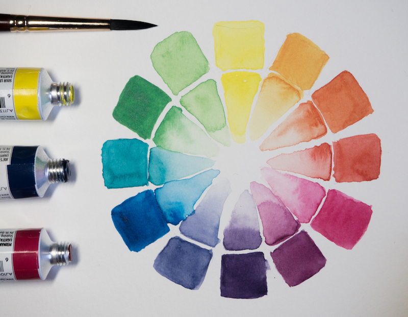
The colour wheel is a visual representation of colours arranged according to their chromatic relationship, and while it’s basic, it’s enough to get you thinking about what colours you can combine in a way they’ll look beautiful together. Created by Sir Isaac Newton in 1666, many versions have since been created, but the most common is a wheel of 12 colours based on the RYB (red-yellow-blue) colour model.
The colour wheel shows you the relationships between primary, secondary and tertiary colours, and which colours are considered warm or cool.
- Primary colours are the three hues that can’t be formed by any combination of other colours. Thus, they are the defining element of the colour wheel. The 3 primary colours are: red, yellow and blue.
- Secondary colours can be mixed by combining two primary colours together. The 3 combinations are: green, orange and purple.
- Tertiary colours are created by combining primary and secondary colours. The 6 combinations include red-orange, yellow-orange, yellow-green, blue-green, blue-violet, and red-violet.
The Munsell Colour System
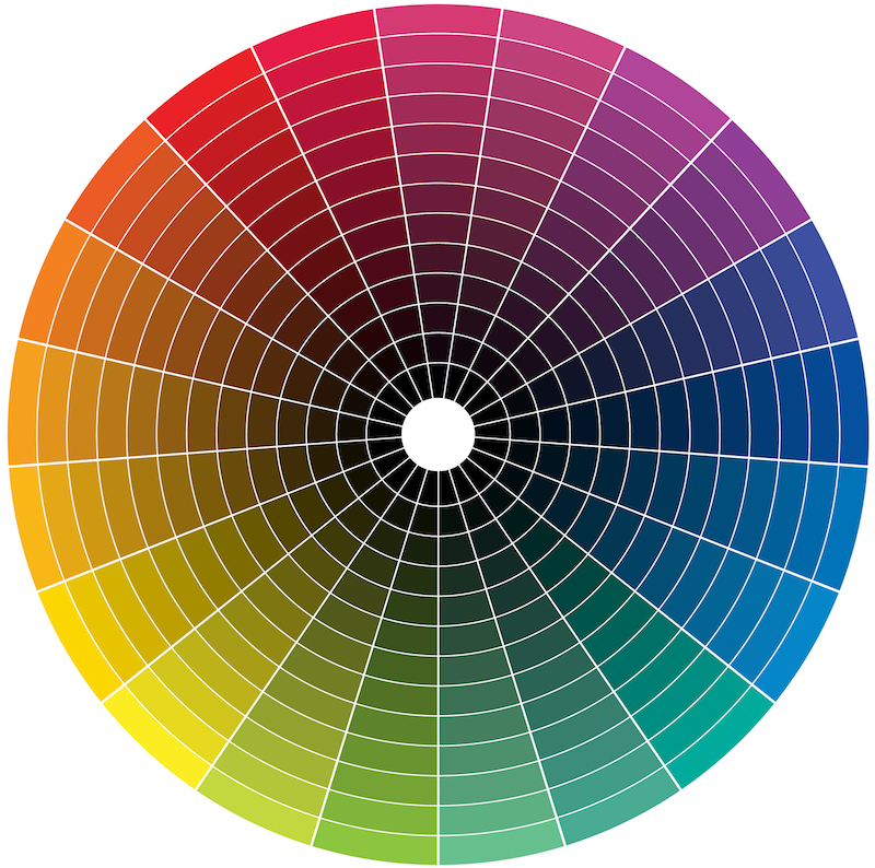
The Munsell Colour System was a major development in the history of colour theory and colourimetry. It takes the colour wheel another step further, introducing hue, value and chroma. It’s based on a three-dimensional model in which each colour is comprised of three attributes of hue (colour), value (lightness/darkness) and chroma (colour saturation or brilliance).
The Munsell Colour System is a system that’s set up as a numerical scale with visually uniform steps for each of the three colour attributes. Each colour has a logical and visual relationship to all the other colours.
- Hue refers to the pigment in the realm of colour theory, the basic colour, tint, or shade. It talks about the attribute of a visible light due to which is stemmed from the primary colours of red, green and blue.
- Value represents the variation in the perception of a colour’s overall brightness. For example if the hue was blue, the value would determine whether it was light blue (high value) or dark blue (low value).
- Chroma refers to the perceived intensity of a specific colour and the higher the chroma, the more “rich” the colour appears. A colour with low chroma, like grey, for example, is seen to be duller than a colour with high chroma. In short, chroma is the purity, intensity or saturation of the colour.
In the Munsell Colour System, hues change as you move around the centre, value changes from top to bottom, and chroma changes as you move from the centre outward.
Colour harmony
What both of these systems rely on is an understanding of colour harmony. To use a colour wheel, pick a colour on the wheel then look at the colour opposite. Using the two colours that have been selected will create a strong contrast, which may work for your piece.
Or, you can pick a colour that sits beside the colour you picked, which will complement the colour in a subtle way. Your overall look will either be warm or cool, depending on what side of the wheel you’re on.
For a painter or designer, being able to match a colour visually using the Munsell Colour System unlocks an objective way of approaching colour. It essentially opens your palette so that you’ve got a full range of the colours available and it allows you to predict the results of colour mixes based on actual hues. There’s no guessing with colour theory — it’s science that creates beautiful colour harmony.
Colour theory as psychology

Once you have an understanding of why it pays to learn about colour theory, it’s time to get to know how you can use this knowledge to your advantage. As we said at the beginning of this article, colour theory is not just about how you mix colour, match colour, clash colour and replicate colour, it’s also about how you communicate with it and how your viewers will perceive it.
Red is all about fire and passion. It’s associated with energy, danger, strength, power and determination. That’s why it’s used as the primary colour for brands like Red Bull, CNN and BBC News.
Orange is a colour of optimism and fun communication. It combines the energy of red and the happiness of yellow to produce an invigorating effect that ultimately makes you feel excited. That’s why orange is used as the primary colour for brands like Sunkist and Nickelodeon.
Green is all about relaxation, nature, balance and growth. It symbolises harmony and healing, and has an air of stability and reliability. That’s why green is used as the primary colour for brands like Land Rover and BP.
Making sense of it all
Colour theory encompasses a multitude of definitions, concepts and design applications. Have a quick search on Google and you’ll be met with a ton of different theories, each different from the last.
The two systems we’ve mentioned above (the Colour Wheel and the Munsell Colour System) are logical examples of structure for colour. Use them to engage your viewer and create an inner sense of order so that balance is the overall experience offered by your work.
Guess your way to colour harmony and you risk a result that’s either boring or chaotic, and nobody wants that. The human brain rejects what it cannot organise, so make it simple for your viewers brains and give them accurate colour harmony. This will let your work shine in the way it should.
Still have questions? The Colour Wheel Company Guides can help you to finally wrap your head around colour theory. Their colour wheels feature a two-sided rotating wheel and are UV coated to minimise fading and protect against moisture. Shop The Colour Wheel Company Guides from Discount Art N Craft Warehouse today.