Getting Started with Calligraphy
Calligraphy is more than just beautiful handwriting. It’s more than just beautiful symbols. It’s more than just arranging letters well. Calligraphy is an artistic process that’s captured ancestry and linguistic trends for thousands of years. To simply say that it’s well-performed penmanship doesn’t do it justice at all.
Calligraphy is creative fire. It’s the signature stamp of a calligrapher’s personality and just like any creative art it can ignite a reaction, invoke deeper meaning, and communicate emotion, passion and the vision of the creator. Each written letter is something personal, something organic. It’s unique and spontaneous and mirrors not just the character and personality of the creator but their mood at the moment of writing. In a word, calligraphy is what connects love, art and human connection with language. Learn how to do calligraphy and more below.
Calligraphy for beginners
Before you start putting calligraphy items in your Discount Art N Craft shopping basket, as a beginner it's important to do some research into the kind of calligraphy you’d like to create and what tools you need to create it. To get you started, we recommend:
Fountain pen
Generally speaking, beginners should start with a fountain pen featuring a still, square-ended nib. (The nib is the metal tip of the pen that holds your ink.) A square-ended nib will work for most types of calligraphy script, and will enable you to create a variety of point widths. It will also give you greater control of your writing as you get used to the delicate art.
For italicised handwriting, try using a fine to medium italic nib and for larger scripts, choose broad, 2B, 3B or 4B. The smaller your pen nib, the more intricate your designs can be.
Italic nibs have a blunt edge and are usually used for Gothic, Italic and square styles. Flex nibs are rounded with two tines that come to a point. The line variation comes from the tines’ ability to split - the more they separate with pressure, the wider the line width.
Dip pen
If you want to experiment and push the boundaries, consider using a dip pen. This will allow you more freedom in choosing nibs, inks and holders. Should you choose an oblique holder, you can write at a steeper angle.
Play around between a fountain pen, straight holder and oblique holder and see what you prefer.
Nibs
Nibs come in all shapes and styles, however for the most part, they look like this:
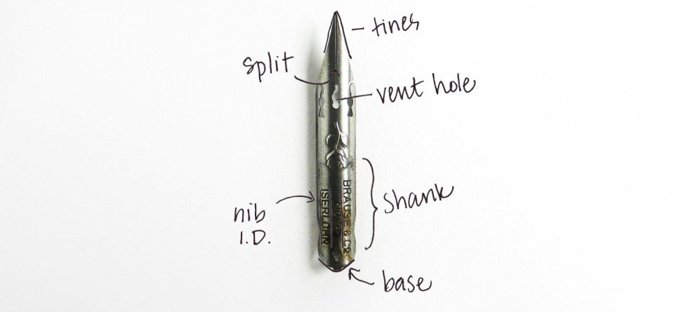
Tines - the two prongs used to write. The more flexible the nib, the more the tines will spread when pressure is applied.
Split - the split between the tines.
Vent hole - helps to regulate the flow of ink by providing a space for the ink to remain as you write.
Shank - the part of the nib that’s secure in the holder
Base - the end in which you’ll slot your nib.
Nib I.D. - the information stating what make and model of nib you’re using.
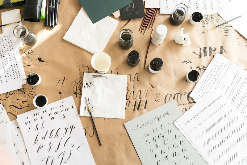
Paper
For the purpose of learning calligraphy, you’ll need to forgo your regular printer paper. On low-quality paper, bleeding is common and this will only lead to frustration for you. Get yourself some practice or layout paper which will allow you trace guidelines through the paper and practice the various pen strokes before moving onto more advanced parchment paper.
Paper is hugely important to a calligrapher. Even practice paper should be high-quality and smooth, as this will help your confidence in writing grow. Japanese Calligraphy Rice Paper is an ideal choice, coming in a 970mm x 10m roll or 457mm x 1270mm roll. The paper soaks up the ink and the result is deep colour with a slightly rough texture.
You might also like to get some blotting paper, a porous paper that can be used to blot text written with ink so that it dries quicker and doesn’t bleed.
Learning basic style
Getting a hold of the most basic calligraphy pen grip should be your main priority in the beginning. So many calligraphy frustrations come from incorrect grip.
Whether you write with your left or right hand, you don’t want to hold a calligraphy pen like you do a standard pen. You want your grip to be relatively relaxed, your index finger bent, and your pen supported by your thumb, index and middle fingers. Your natural reaction might be to let your fingers ‘run the show’ as they do in normal writing, but allowing these will lead to less than desirable results.
This video is a great example of how a calligraphy hold differs from a regular hold.
Getting to grips with your grip
When you write, try to keep your index finger only slightly bent. Your finger movement should be minimal, with most of your movement coming from your arm. You’ll need to watch your posture for this, sitting up straight and breathing slow and regularly.
Try not to hold the pen too far up either. Your hold should be around ½” from the end, which will still give you good control of the pen and will allow you to apply good pressure. If you hold your pen too close to the nib, you won’t get the pressure than you need.
If you’re using an oblique calligraphy pen/holder, check out this video.
Learning calligraphy terms
Calligraphy terminology is a language you’ll need to familiarise yourself with. Common terms include:
- Baseline: The invisible line in which your letters sit.
- Cap height: the invisible line that marks the height of a capital letter.
- X-height: the height of a typefaces’ lowercase letters
- Typeface: a design of an alphabet where letters have been crafted in a similar style work together.
- Ascender: part of the letters that extend above the main writing line (h, l, k etc)
- Descender: part of the letters that extend below the main writing line (g, y, p etc)
- Point size: the distance from the top of the highest ascender to the bottom of the lowest descender.
- Bookhand: scripts and alphabets used prior to the printing of books.
- Counter: the shape created on the inside of a letter.
- Deboss: To create a downward indention.
- Emboss: to create a raised indentation.
- Font: a digital file of typeface.
- Hairline: the thinnest stroke made with a pen.
- Kerning: the horizontal spacing between horizontal lines of text.
- Tracking: the uniform amount of spacing between characters in an entire section of text.
- Letterform: the form or shape of a letter.
Learning calligraphy styles
Just as there are terms, there are many different styles for you to master. Some of these styles include:
- Round Hand: characterised by an open flowing hand and subtle contrast of thick and thin strokes.
- Copperplate: an English Roundhand script style represented in copybooks
- Drop Cap: where the first capital letter of a paragraph is set in a larger point size. (Often seen in older books to indicate the start of a new chapter.)
- Flourish: added strokes or swirls used to decorate letters.
- Majuscules: capital letters.
- Minuscules: lowercase letters.
- Monoline: letters written in a single width of stroke the entire way through.
- Serif: small decorative strokes added to the end of a letter’s main strokes.
- Sans-serif: clean, simple letters without serifs at the end of a letter’s stroke.
- Hummingbird: an old-fashioned and elegant style with many cursive details.
Getting set up
Are you a beginner ready to start exploring calligraphy? All the equipment and materials you need can be purchased at Discount Art N Craft Warehouse, so why not get started today? Discover our range of calligraphy here, including pens and markers, nibs and holders, calligraphy sets and calligraphy inks.
Visit our other drawing articles, here: